Step 1: Make an anchor chart.
Step 2: Hang up the anchor chart.
Step 3: Leave the anchor chart hanging around your room all year and never refer to it again.
Believe it or not, there's more to an anchor chart than a cute decoration for your classroom.
Here are 6 Common Mistakes Teachers Make with Anchor Charts:
1. Creating on the fly
Just like most other parts of a lesson, anchor charts require planning ahead. This applies to both the content that is going to go onto the anchor chart as well as things like spacing and how you are going to group content in a meaningful way so that students can make sense of it on the page. There are some things you can pull off by flying by the seat of your pants, but coming up with a thoughtful, well-designed anchor chart off the top of your head while standing in front of a classroom filled with students is not one of them. Make a plan and stick to it!
2. Too much content
I have always loved creating anchor charts for the classroom. In fact, when I create them for our classrooms and our Teachers Pay Teachers Store, I ask my husband, Clint, to give me feedback on them. It often turns into him reminding me that an anchor chart is not meant to include every detail of a lesson. There’s an art to that whole “less is more” idea and we need to be mindful that there's no way you can capture an entire unit or even an entire lesson on just one page. You have to be selective about what you decide to include on your anchor charts because if you overload with content, students can feel overwhelmed. Or they can lose any sense of where to find information on the chart. I often ask myself, “What is the most important part of the concept that I want students to understand?” and “What is the part of this lesson that I know students are likely to struggle with?” Those questions inform the content for my anchor charts.
3. Too much text
You’ve seen them, haven’t you? Those anchor charts with so much text crammed on one page (or spilling over to a second!) that you don’t have ANY interest in reading to know what it says? Well … if you feel that way, wouldn’t students feel the same? Similar to the mistake of having too much content on an anchor chart, it's common to see too much text on an anchor chart. Unless your anchor chart is super simple with only one sentence on it or unless it’s an ELA topic that requires examples of full sentences, you shouldn't write complete sentences on an anchor chart. Stick to keywords or bullets/phrases only.
4. Unreadable fonts (small or fancy)
Yes, anchor charts do make beautiful and meaningful classroom decorations, but we need to make sure that students can read them. If your students cannot read cursive handwriting, then you should not use a cursive font on your anchor charts. Also, we want anchor charts that are easy to read and that students can quickly find and interpret information. Script fonts are cute, but they can often get in the way of the anchor charts’ function. In addition to the type of font used, sometimes we write on an anchor chart in a font that is too small to read. If a student cannot read a font from the other side of the classroom, the font is too small.
5. Not referenced throughout or after the lesson
Ideally, an anchor chart is something that is built or revealed throughout the course of a lesson. We want students to have ownership in creating the knowledge for anchor charts. I personally choose to print my anchor charts as posters and to hang them up in class, however, I would often solicit ideas from students as I was introducing the anchor chart so that they could have some input and understanding. Also, anchor charts should not be a “one-and-done” event during a lesson. They should be accessible for students and we should expect students to reference anchor charts as a tool as they continue to develop mastery of the skill. Students will not innately know that an anchor chart is a tool they can reference for help. That’s why it’s important for teachers to model using an anchor chart for help as well as guide students to review it for themselves when they have questions.
6. Not accessible to students (only having one)
The final mistake I see teachers make when it comes to teaching with anchor charts, is that they only provide one. I like giving students their own copies of an anchor chart to put in a notebook as well as turning anchor charts into posters that can hang in a designated space on the wall. Think about it this way: I use A LOT of chapstick … I’m talking a lot as in hourly applications. So what do I do? I keep one in every location where I might sit still for more than 2 minutes. It needs to be accessible to me no matter where I am. If we want students to use anchor charts to reference important information, then we need to have anchor charts available wherever students might need them.
So those are some of the mistakes I know I and other teachers have been guilty of before.
What are some mistakes that you have made with anchor charts in your own classroom? Also, what anchor chart tips would you share with other teachers?
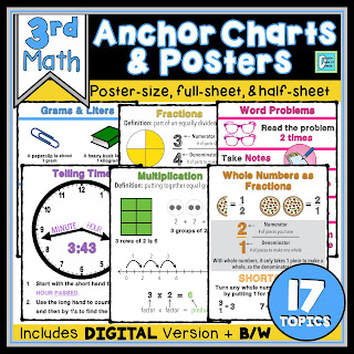
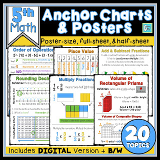
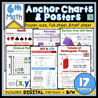
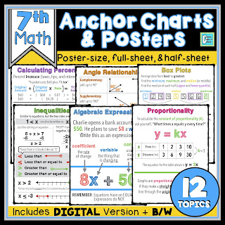
If you are interested in checking out our ready-to-print Math Anchor Chart & Poster Bundles for 3rd through 7th grades, the links are listed below.




No comments
Post a Comment